
The Problem

The Solution
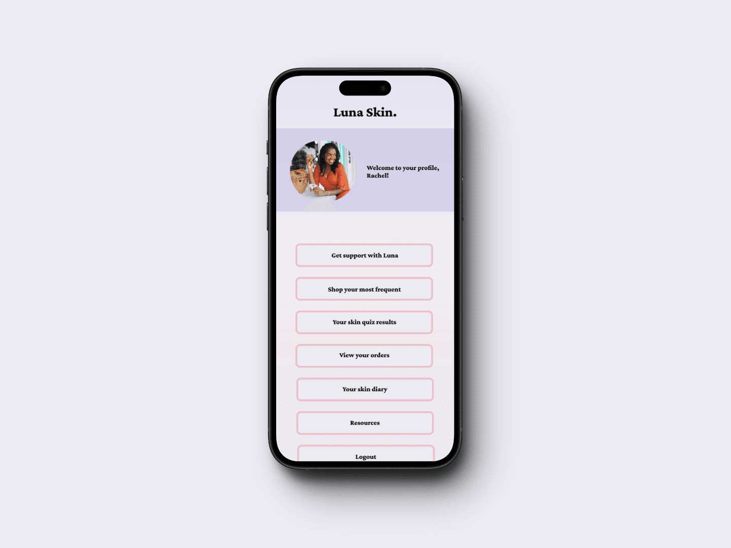
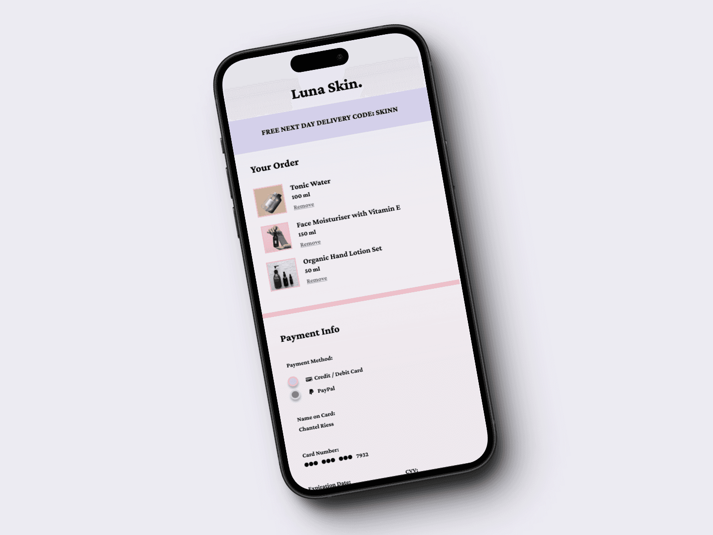
Mobile app and desktop compatible screens which included a homepage, support page, and checkout page. I also ensured that this design was accessible for user's with a dark mode option.
The Result
In order to make my skincare platform (app and desktop) as user friendly and accessible as possible, I carried out extensive primary and secondary research. From this research I was able to evaluate what users needed the most and what users needed the least. Gathering data from research was important as I was able to set clear goals in order to achieve the desired final outcome.
I can say that the LUNA Skin platform has achieved the goals set for this case study. It accurately targets users of all skin types, helps them feel supported through a trusted support group and allows them to easily shop for products without feeling frustrated. It also is bright and engaging which will help users want to stay on the app for a longer period of time.
One of the biggest challenges I faced in this case study was ensuring that the colours chosen were appropriate for the company, whilst also meeting the needs of users. I experimented with different shades of purples and pinks and ensured that the phycology behind the colours matched how I wanted the company to be portrayed.
Overall, I had a lot of fun during this case study as I was passionate about the topic and the branding aspect. However, it has also been both eye opening and challenging. Moving forward, I will take on board the improvements above and manage my time efficiently.
Thanks for reading.


Framer
© 2024 Tamika Arnold.